


The degree to which individuals trust the information depicted in a chart can significantly depend on their assumptions about the creators of the data visualization, according to a pair of studies conducted by researchers at the Massachusetts Institute of Technology (MIT). These findings suggest that even the clearest visualizations communicate more than just the data they explicitly depict, often evoking strong judgments about the social contexts and identities of those who made the chart.
For example, if a viewer believes that a graph about a contentious issue such as gun violence was produced by an organization opposing their beliefs or political views, they may discredit the information or dismiss the visualization altogether. This phenomenon highlights the complex interplay between data presentation and social perception.
Design Elements and Social Inferences
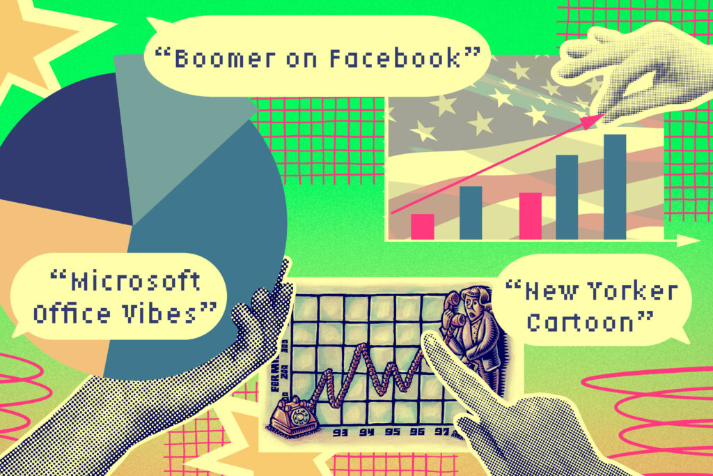
The MIT researchers discovered that readers make assessments about the social context of a visualization primarily from its design features, such as the color palette or the arrangement of information, rather than the underlying data itself. These inferences are often unintended by the designers but can significantly impact how the data is perceived.
Through a combination of qualitative and quantitative studies, the researchers found that these social inferences are not restricted to specific subgroups and are not necessarily a result of limited data literacy. Instead, they appear to be a natural part of how individuals interpret visual information.
“If you are scrolling through social media and you see a chart, and you immediately dismiss it as something an influencer has produced just to get attention, that shapes your entire experience with the chart before you even dig into the data,” says Arvind Satyanarayan, an associate professor in the MIT Department of Electrical Engineering and Computer Science (EECS) and co-senior author of the research.
Charts as Social Artifacts
During the height of the Covid-19 pandemic, social media was inundated with charts from organizations like the World Health Organization and the Centers for Disease Control and Prevention, designed to convey information about the spread of the disease. The MIT researchers studied how these visualizations were being used to discuss the pandemic and found that some citizen scientists were using the underlying data to create visualizations of their own, often challenging the findings of mainstream science.
This unexpected discovery led the researchers to explore visualizations from a social and linguistic perspective, assessing the information they convey beyond the data. Linguistic anthropologists have long understood that language communicates social meaning beyond the words themselves, and the researchers wanted to see if visual language might function similarly.
“We wanted to see if things in the visual language of data communication might point to certain institutions, or the kinds of people in those institutions, that carry a meaning that could be unintended by the makers of the visualization,” explains Graham M. Jones, professor of anthropology and co-senior author of the research.
Quantitative Studies and Future Directions
Building on their initial qualitative work, the researchers conducted three quantitative studies involving surveys sent to larger groups of people from diverse backgrounds. These studies confirmed that people make inferences about the social context of a visualization based on its design, leading to potential misunderstandings and mistrust in the data it depicts.
The researchers developed a classification framework to organize the social inferences users made and the design elements that contributed to them. This typology serves as a tool for designers to create more effective visualizations and as a foundation for further studies.
“Part of the value of this work is a methodological contribution to render a set of phenomena amenable to experimental study. But this work is also important because it showcases an interdisciplinary cross-pollination that is powerful and unique to MIT,” notes Jones.
Moving forward, the researchers aim to continue exploring the role of data visualizations as social artifacts, possibly by focusing on each design feature identified in their typology. They also plan to expand their study’s scope to include visualizations in research papers and scientific journals.
This research was supported by MIT METEOR and PFPFEE fellowships, an Amar G. Bose Fellowship, an Alfred P. Sloan Fellowship, and the National Science Foundation, highlighting the collaborative and interdisciplinary nature of the study.